Feed on
Posts
Comments

Avoid Redundant Alternative Text

Images and related text are often paired together, such as a product image with the product name immediately below it, or a photograph with a caption. In instances where the text conveys the content of the image, the image should usually be given null or empty alternative text (alt=””). This avoids the redundancy of having a screen reader read the same information twice (once for the image alternative text and once for the caption or adjacent text).

If the image and the adjacent text are links to the same location, combine both the image and the text into one link and give the image null alternative text. This avoids redundancy, results in fewer links for the user to navigate, and results in fewer links for the user to navigate.

Tactile Overlays for the iPad

Contributed by Lori Markland, Director of Communications, Outreach and Development, MDTAP

For students with visual disabilities, tactile overlays on an iPad can be helpful when using apps that don’t “slide” across the screen, such “Scene and Heard” or “Book Creator.” By creating an overlay with tactile cues, the student can more easily navigate the screen interact with the app. Below are a few tips for starting out:

Start with an overlay that can be modified, such as

  • see through plastic page protectors
  • overhead projector sheets
  • see through plastic baggies
  • or mylar

Either slide the iPad into the plastic baggie or protector OR attach the projector or mylar using double-sided sticky take along the plastic edge of the iPad.

Place a tactile cue (such as a stick on rhinestone, puffy paint, fabric sticker, etc)  in the top left corner of the overlay in order to help the user orient the top from bottom.

Then, use tacile cues on the overlay that coincide with the app that is being used. For example, if the student needs to press the “next page” button to go from page to page in the book they are reading, place the tactile cue on the overlay where the “next page” icon is. Remember, if you are using a tactile cue that the student will press on/interact with (instead of the cue serving as just a guide), then the cue needs to be conductive between the user’s touch and the idevice screen.

It’s that simple! And if you’d like to see examples of some DIY tactile overlays for the iPad, Pinterest is a great place to find these!Tactile overlay being used with the Toy Story Read-a-loud app. The tactile cue indicates where to press on the screen.

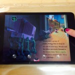
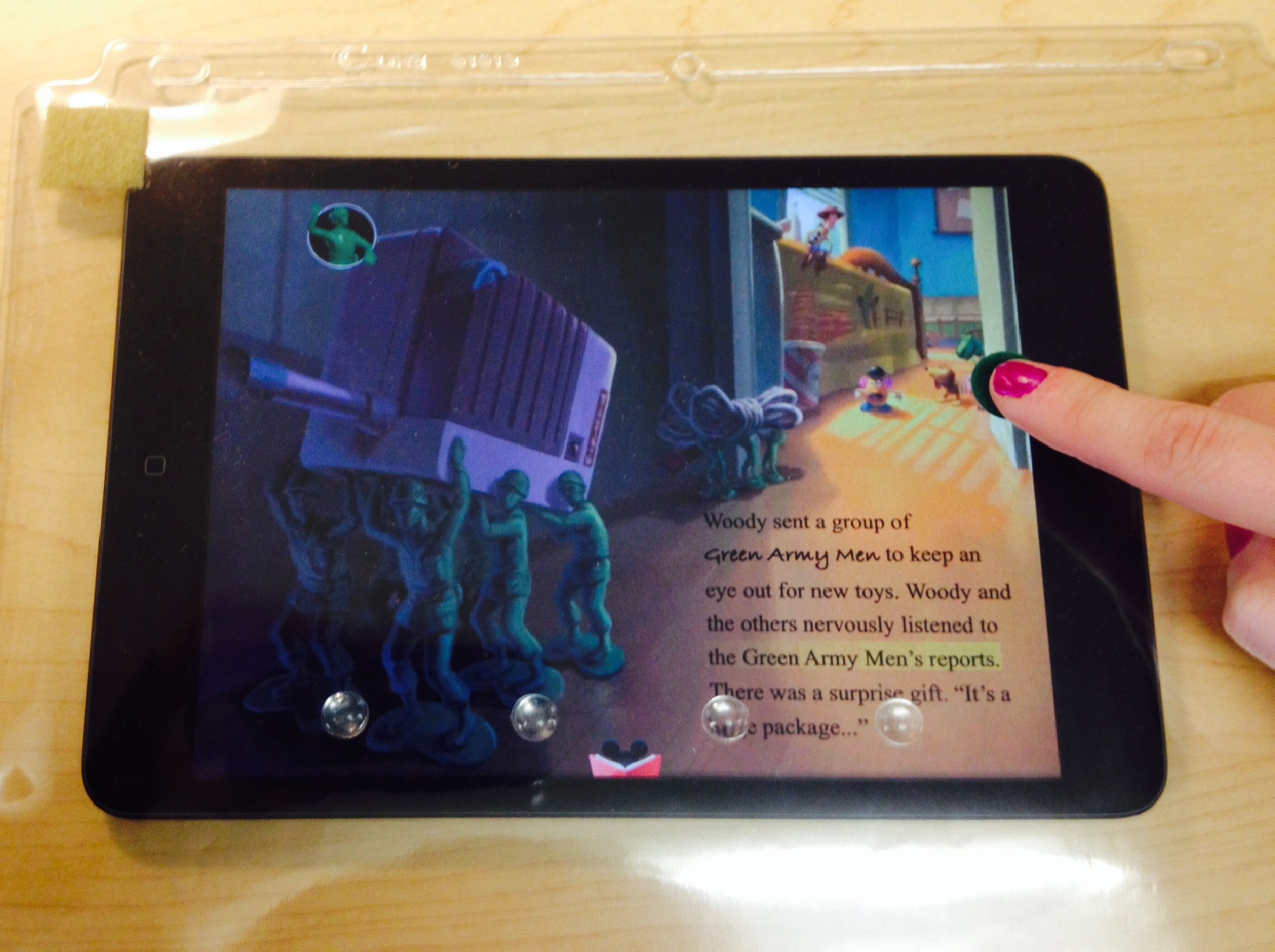
Here’s my attempt at a tactile overlay using the Toy Story Read-a-Loud app that both reads the text and highlights the words. I used a green felt sticker as a tactile cue to help orient the user as to where to press on the screen to turn the page. The sticker itself is not conductive. so the user needs to press next to or above the sticker, not on it. I also used clear stick dots on the overlay along the bottom to help orient the user to the page.

Aids for daily living shelves that hold a variety of low tech devices for independent living

Aids for Daily Living

Blind and low vision table with writing guides, large print activity books, talking calculator and more

Blind & Low Vision Writing Table

Kitchen Aids

Kitchen Aids for daily living

We’ve been adding new technology to the Maryland  TAP AT Library as well as setting up new areas to house more aids for daily living, blind and low vision devices, and recreational items.

And if you’d like to stop in and see what we’ve been adding, sign up for our next AT Library Tour on November 19th!


Well done, science. Well done.

AT News Wrap Up for the week of 9/22 thru 9/26.

The Next Decade of Neurostimulation: Interview with Simon Karger from Cambridge Consultants

TalkBack is an Accessibility Service that helps blind and vision-impaired users interact with their devices.

Coming Soon-SAMHSA’s Suicide Safe app for primary & behavioral health care providers

Annual Career Expo for People with Disabilities in Washington DC on November 21, 2014 from 10:00AM – 3:00PM

O’Malley ‘inclined’ to support use of ballot tool for blind

Schoolboy Josh’s invention helps people to see clearly

New brainwave test may improve diagnosis for autism

Astounding! Finding A Voice — Again — In The Pages Of A Comic Book

So handy! Examples of making irregular/complex data tables accessible

App to aid disabled close to big time

New smartphone app that gives sight to the blind

Paralyzed Marine walks thanks to ReWalk technology


Mobile Apps for Emergency Preparedness

Contributed by Provi Sharpe, Director of Emergency Management and Equipment Reuse

Although it’s impossible prevent natural disasters from occurring, there are plenty of things we can do to better handle the impact of such events. Organizations both large and small have embraced mobile platforms as vital tools for disseminating important information. This includes advice on how to prepare for an emergency, what to do once that emergency arrives, and how to cope with the aftermath.

Organizations offering emergency preparedness apps include: The Red Cross, which offers several mobile apps for emergency preparedness and FEMA, which offers mobile apps with preparedness information for all different types of disasters

Some very useful emergency preparedness mobile apps include: Hurricane Software offers real-time satellite data, the predicted hurricane path, strike possibilities, wind speeds, and more. Pocket First Aid and CPR, developed by the American Heart Association, includes hundreds of pages of instructions on what to do in emergency situations. ICE Standard is an emergency card app, which lists an individual’s complete medical history, emergency contacts, insurance details, blood type, and more. Disaster Alert app is a listing of ‘Active Hazards’ occurring around the globe. Disaster Prep offers an emergency preparedness checklist and guide.

This is just a short list of the many useful and free apps currently being offered.

Icons vs. Text

Icons can present complex information, meaning, and functionality in a very small amount of space. A browser’s “Home” icon (typically an illustration of a house) readily conveys rather complex meaning and functionality – activating it will take you to the browser’s defined home page. While such icons can be very useful, care must also be taken to ensure that the icon is understandable to the end user and reflects well-known conventions. The floppy disk icon, for example, is used for “Save”, yet the real-world connection between saving a file and an actual floppy disk (something that is rarely seen and no longer produced) is not present for many people, particularly newcomers to the web and youth. Real text (“Home” or “Save”) should be used in place of an icon, or perhaps in conjunction with an icon.

« Newer Posts - Older Posts »

MDTAP | 2301 Argonne Drive, Room T17 Baltimore, Maryland 21218| Voice: 410-554-9230 Toll Free ⁄ Voice 1-800-832-4827|Email: mdtap@mdtap.org